
Wednesday, 15 December 2010
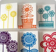
More card research

Wednesday, 8 December 2010
Train Research
I am thinking of doing a train design as one of my card illustrations so here is some inspiration for me.
I love the colours and style used in these illustrations. These images are from a book called Train to Timbuctoo, written by Margret Wise Brown and illustrated by Art Seiden, published by Golden Books in 1951.
I adore this retro jigsaw on Wooden Donkeys site at flickr, it reminds me of a cross between something off pigeon street and the yellow submarine.
I have looked at this illustration before on a different project, its illustrated by Toru Fukado, a Japanese illustrator. Again loving the use of shape and the basic colour palette. Grain Edit is a site I find I visit a lot, they seem to have the same love for retro inspired illustration as me and they have really good interviews with illustrators which can be both inspiring and informative.
Sunday, 5 December 2010
More card research

I love Jane Fosters work, her use of simple shape combined with patterned line makes these screen prints work really well.
graphicdesighforum.com
I don't know who the artist is but again these have a retro feel about them.

These illustrations by Amanda Visell have a very retro feel about them, I also like the blocky shapes she uses.
These illustrations by Lab Partners have really captured the retro feel. I think the use of simple shapes combined with contrasting line work has helped to achieve this retro style.
Saturday, 4 December 2010
Card design research
.

I like the contrast of the patterned background against the flat colour of the owls, got to stop looking at owls!

Not a very clear image I know, but looking at the variety of themes within this collection of card designs, makes me think that perhaps I do not need a overiding theme to my designs and that the style of my illustrations is what brings the whole collection together.
I am loving this retro style of Darling Clemantine, what a great name as well !!
Saturday, 27 November 2010
Macmillan Childrens Book Prize
I have decided to produce an ABC book as an entry for the prize. This will help me concentrate more on the illustrations and less on producing the text, it also gives me focus for the main 26 pages required for the entry. What theme I do not know yet. I would like to lino cut the letter shapes and use the screen printed swatches I will make to produce simple page designs in keeping with my style.
Towel Design
wikipedia.org
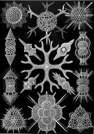
To help inspire for my towel print design I have decided to look at plankton. The reason for this is that it is not an obvious choice for surf design, but still involves the sea. I like the shape of these creatures and I feel I could create an interesting pattern design with this inspiration.
Experimental Screen Printing
For the next stage of my development I would like to experiment with screen print to produce abstract prints that I can scan in and used as swatches in illustrator, this would help me to further my knowledge of screen printing in a more experimental way whilst expanding my library of swatches.Which I can then use in further projects.
Egg People
These characters inspired by The House of Fairy Tales are created in illustrator using fabric and paper swatches that I have created. These characters could be used for a project in the future, what I don't know yet.
Lino print owls
Owls on wood
Owls on coloured paper
Experimenting with linocut and various surfaces, these designs can work well as one off limited edition prints or card designs.
Owl on ripped tissue paper
Experimenting with linocut and various surfaces, these designs can work well as one off limited edition prints or card designs.
Owls
A 'personality of owls' using illustrator as my design process, I still can not decide which background I prefer. I need to make a couple of small changes and then they are ready to be printed into posters.
Christmoose cards
To create my Christmoose Cards I used a moose design that I created earlier on in the year. I then put the moose in different situations and poses.
I used illustrator and tissue paper swatches I created as my main design process. To finish off this project I need to send these designs off to appropriate publishers.
Screen printed childrens book
Using the quote 'After dark all cats are leopards' I decided to create a childrens book using screen printing as my main process. To create these images I decided to use simple shapes and a two colour screen printing process. I feel the contrast of dark and light works well as a double spread. I would like like to submit some of these designs into the Bolgna Book Fair but to do this I need to re-work the text.
Subscribe to:
Comments (Atom)


