
Wednesday, 15 December 2010
More card research

Wednesday, 8 December 2010
Train Research
I am thinking of doing a train design as one of my card illustrations so here is some inspiration for me.
I love the colours and style used in these illustrations. These images are from a book called Train to Timbuctoo, written by Margret Wise Brown and illustrated by Art Seiden, published by Golden Books in 1951.
I adore this retro jigsaw on Wooden Donkeys site at flickr, it reminds me of a cross between something off pigeon street and the yellow submarine.
I have looked at this illustration before on a different project, its illustrated by Toru Fukado, a Japanese illustrator. Again loving the use of shape and the basic colour palette. Grain Edit is a site I find I visit a lot, they seem to have the same love for retro inspired illustration as me and they have really good interviews with illustrators which can be both inspiring and informative.
Sunday, 5 December 2010
More card research

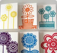
I love Jane Fosters work, her use of simple shape combined with patterned line makes these screen prints work really well.
graphicdesighforum.com
I don't know who the artist is but again these have a retro feel about them.

These illustrations by Amanda Visell have a very retro feel about them, I also like the blocky shapes she uses.
These illustrations by Lab Partners have really captured the retro feel. I think the use of simple shapes combined with contrasting line work has helped to achieve this retro style.
Saturday, 4 December 2010
Card design research
.

I like the contrast of the patterned background against the flat colour of the owls, got to stop looking at owls!

Not a very clear image I know, but looking at the variety of themes within this collection of card designs, makes me think that perhaps I do not need a overiding theme to my designs and that the style of my illustrations is what brings the whole collection together.
I am loving this retro style of Darling Clemantine, what a great name as well !!
Subscribe to:
Comments (Atom)


